Showing posts with label Digipak. Show all posts

Wednesday, 5 April 2017

DIGIPAK: Final Version

This is the final version of the digipak 


After getting feedback from my teacher, I have added the following details:
- I sharpened the opacity on the barcode to 100%. I did this because in every example I found, the barcode is sharp.

- I added some bonus tracks to the track listing. As this is a compilation album, it is important to add new unreleased tracks or new versions of songs in order for there to be a reason to buy it, as all the other tracks are on previous albums. The names for these tracks are "BORN", "DIRT" and "THE FIELDS" I like these names as they fit in really with the other grungy titles of their songs, and therefore also fit well with the genre.

-I made the "BMTH" on the spine a lot smaller and put it after the band name as this is much more common that it being before. I also added the SONY logos. and a catalogue number.

- On the front cover, I added a sticker that says "Featuring 3 Exclusive New Tracks" as this will draw attention to the new content and therefore attract the audience to buy the Digipak. I did this in a dark bluey/grey colour as I wanted it to stand out from the black and white colour scheme but also flow well altogether as a whole. 

Friday, 17 March 2017

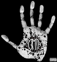
DIGIPAK: Front Cover Final Version


This is the final version of the front cover.

Below you can see a vodcast, which I created, in which I explain how I created the final version in Adobe Photoshop. I edited the vodcast using Final Cut Pro X on our Mac's in school. While working in Photoshop, I took screenshots along the way, using cmd alt and 4 so I could select and control exactly what I was taking screenshots of.


I used my phone to record the audio for this, imported it into final cut and layered it over the images. I chose to do a vodcast rather than screen record as I plan to do a couple more screen recordings when doing either the back cover or inner panels.


Monday, 13 March 2017

DIGIPAK: Back Cover 2

This is a new idea and design of the digipack, since my teacher argued that the digipack draft 1, was a bit clumsy compared to the front cover, which I definitely agree with. I decided to try out using smoke that features in our music video.  I also added the track list, record label and barcode, which you can see in the timelapse below. I recorded the audio on my phone as I find the quality comes out better that recording it from a laptop.


Here is the finished Timelapse:


Saturday, 11 March 2017

SR/BV: DIGIPAK: Complete Digipak Version 1

This is the first draft for our complete digipak. Bronwen used a digipak template that she found online and copied it into photoshop. 

The feedback we got was that the front cover (hand), was good, but that the back looked quite clumsy in comparison to the hand, so Bronwen should change it. We thought we would then do a back cover with smoke, which I have done a post on. 

The feedback from my teacher on the inner pannels was that the image doesn't look like one flowing image, so it would be better to have a single flowing image. He suggested we use a shot of the male protagonist when he is in the water, just so the picture isn't so bare, or maybe layer a band photo onto the pool shot. 


Bronwen created the spine using this template rather than in a separate document. The spine was mainly inspired by the spine for "The Resistance" by Muse. She created that the spine was running from the front cover. This was because the main three examples that we looked at had this feature. She felt that it would also flow better from front to back rather than the other way around. She didn't add the logo onto the spine, as i features on the front cover and she thought the name of the band would be enough for the spine. Our spine is also very thin, since we only have 2 inner panels. Digipaks with 3 inner panels would usually have a larger and thicker spine

Friday, 10 March 2017

DIGIPAK: Final Back Cover

This is the final design for the back cover of our digipak. I discuss what small details and changes were made on this blogpost. 


SR/BV: DIGIPAK: Back Cover Details

There are several things that have to be on the back cover and spine of the digipacks. These include the record label, the copyright symbol, the track list, the barcode, a QR code and even if necessary a parental advisory explicit content symbol.


Bronwen found a website called barcode generator, where she could create a barcode and a QR code. This was very useful since she was able to create a QR code that would immediately link to our website, when scanned on a smartphone for example. The website also allowed her to type in what she wanted under the barcode, so she typed the usual random numbers in that are under a barcode and added 4 big letters B, M, T, and H for Bring Me The Horizon, which gives it a little extra something, since it becomes more individualised to our own band. 


SR/BV: DIGIPAK: Inner Pannels Draft 1

This is the picture that we wanted to have as our inner panels in the digipak. Many of our viewers of the music video also liked this shot, since it is just very special due to the natural appearance of the bubbles and the waves. Also, I added an effect on all the pool scenes called Tint, in Final Cut Pro X, so that it wouldn't look as baby blue as the normal pool.


DIGIPAK: Back Cover: Smoke


For the back cover, I wanted to include a smoke like effect. I did this because there are a couple of scenes in our video that have this effect. I tried it out with some different colours, turning down the saturation still to get a more muted tone.

I did not like the way that the other colours turned out so I decided to go for grey, because the darker more neutral colours fit better with our genre and the conventions of rock. 


Thursday, 9 March 2017

DIGIPAK: Back Cover

After having looked at this example by the band Muse, I decided to try and create something similar. I liked the blurry, black and white look of this picture. Inspired by this, I decided to layer a photo of the band over an image of Luxembourg city. I think that this will give a nostalgic feel to the album, which fits well as it is a compilation album and there are some old songs on it. Have their hometown in the background will give connotations of home and safety which the audience could relate to, especially If they come from the same city.
EDIT:
Here is the final digipak back cover draft 1. I quite like the way this turned out and I think that it is quite similar to the Muse one.
However, when comparing it to the front cover I did, it really takes away from the simplicity of that. Therefore, I will create a second draft and take a more simplistic approach.

Wednesday, 8 March 2017

SR/BV: DIGIPACK: Back Cover: Research

For the back cover, we did some research, looking at several back covers from different bands including Artic Monkey, the 1975 and Bring Me The Horizon themselves. 
Doing research about this is necessary, so that I could create a good digipack that achieves versimilitude, and that I would know where to put every little detail such as the barcode, the record label, the tracks and the other CD details. 

The one example from BMTH's "That's the Spirit", as you can see it on your left included 11 tracks, the barcode at the top and the record label and copyright details at the bottom. Since our digipak is going to include all of their best tracks so far, we are going to use tracks from each of their 5 albums. The thing that would make the most sense would be to use the songs that have the best hits. We are also going to create our own names for some tracks and invent new tracks, because fans will then be more likely to buy the album. Old albums with old tracks have already been used, so we should make the digipak as if we are trying to access the market with a new album, that fans would buy.  

We thought that this back cover is a bit too simplistic, because it is just black. Since we are using colored smoke in the music video we might want to include some either colored smoke or some grey/white colored smoke. Bronwen might also try to use some color effects on the smoke, which I will be doing another post on. 

Tuesday, 7 March 2017

KO: DIGIPAK: Inspiration (hand)

For our digipak we looked at other band in all genres for inspiration. I thought that the CD cover for Kaleos A/B could look good. The cover is of an x-ray of the 4 band members hands.


This also reminded me of a movie cover for "Identity" (2003) where you have a hand print and each of the fingers is a character in the movie.
Some ideas we could do for this is having one hand in the front with the logo of the band in the middle of the palm and have the faces of each band members on the end of each finger. We could get the hand print from scanning a hand and printing it out and the rest could be done on Photoshop.

Monday, 6 March 2017

DIGIPAK: Inner Panels Final

This is the final Draft of the inner panels.

I am happy with the result as I think that it:

-Fits well with the metal core genre

-Ties in very well with the rest of the digipak (front and Back Panels)

-Attractive to our target audience


I created this, like the rest of the digipak, using Adobe Photoshop CS5.
I took this pink smoke effect  ( this can be seen on the screen recording for when I made the back cover as I used the same image) from our music video and removed the lead singer from it using the eraser tool. I duplicated the layer a couple of times and then re scaled it and transformed it in order to fill in some gaps.

I also decreased the saturation a lot so that it would fit better.


Sunday, 5 March 2017

DIGIPAK: Inner Pannels Draft 2

For this draft, I decided to remove the background of this band image.


I used the eraser tool and had to manually cut around the band members as because the background was too complicated, the magic eraser tool did not work.

I put it onto a black background which fit really well with the front panel. However, it looks a bit dull.

I will do another draft but try to add a filter as I think this will add more interest.


Saturday, 4 March 2017

DIGIPAK: Inner Panels Draft 4

I have attempted to layer an image onto the band photo.

I chose this one of water as I thought it would look effective.

I changed the opacity of the water image, and layered it over the band photo.

However, I think that this looked far too random and out of place.

Friday, 3 March 2017

DIGIPAK: Inner Panels Draft 3

As the last draft was a bit boring, and I received feedback from a teacher that agreed with this.

I looked up a tutorial on how to add blur to photoshop.

I decided that adding motion blur would be the best idea. I added this at a 70 degree angle.

I did not like this effect as I thought it needed something extra going on, as again it was a bit dull.

I will do a third draft using this image, perhaps using layering with an image from our video

Wednesday, 1 March 2017

DIGIPAK: Ideas


To start with I came up with some ideas for 3 different versions of the digipack. I was pretty unhappy with these as I found that they are too busy and I wanted to stick with a more minimal vibe, which would be in keeping with the image that Bring Me The Horizon have at the moment. I think that the black and white one worked well, so when I start to create other drafts of the digipak, I will keep to this neutral colour scheme.


These are just some initial ideas, as I wanted to start experimenting with colour schemes, editing and the layout of digipaks. I also need to do some more research about the placement of details such as barcodes and other stickers. As I had not yet done any research for the spine, I decided to leave that out for now, and return to it when I had sufficient research to support me.

Wednesday, 25 January 2017

SR: UPDATE: Changing Digipack: Throne

After having changed our track and the idea for our performance and narrative, we have new pictures for the digipack. We also had to find two new band members due to one drop-out and timing. Right now we are working on what pictures should be on our digipack but also, which other elements are usually included on a digipack.

For the front cover, we were thinking of having a picture of the entire band rather than just having the leadsinger and including the name of the band. This is not the finalized version of the front cover, since we still want to work with color correction of the picture to make the color's stand out even further. 


Another possibility for the front cover would be to take a picture in the green screen room with just the leadsinger in the shot, with his microphone and then layer on top of it and add the title of the band and/or the album. This would be inspired by BMTH album for Suicide Season

Another important elemt of a digipack is the track listing. BMTH That's the Spirit album has 11 tracks, therefore we thought we would include these on the back cover. 

To achieve verisimilitude on our digipack it is also important to include other features such as the record labelproduced bycopyright detailsbarcode and serial number. On most digipacks, the barcode is on the back cover, hence we have decided to put it down in the corner on the right side. 


Inside the digipack, we wanted to include some more colors such as BMTH did on their That's the Spirit album inside. We thought that we could do it by having colorful ink in water that looks a bit like colorpowder. Since color powder is also a part of our music video, we thought that we would want to include that. 


When doing some research on digipacks, I found a website, where it is possible to create and design your own digipack with fonts, pictures etc. Once we have all of our ideas sorted and photoshopped, I wanted to try and create one with the use of this website. If it turns out really well, I intend to order it. 


Sunday, 18 December 2016

KO: DIGIPAK: Update inside cover: Follow You

Having discuss and though a bit more about the digipack we have decided to not use the picture of the guy looking at the sun as the back cover but instead have it as the inside cover going over both pages.

Doing this gives us the opportunity to edit other images inside the bricks and also have word be slanted following the wall.

Wednesday, 14 December 2016

Digipak: Font Research


In our video, we decided that the font of the band and song name at the start of the music video would be the same as the font used on the digipak.

In order to decide what font to use, I looked at other band's fonts and logos, of both metal core and rock genres.


Through my research, I found that all of the bands logos and fonts are either black font with a white background or white font with a black background. On my right you can see some of the fonts I looked at including from Bullet for My Valentine and Asking Alexandria.

I also went to dafont.com and found a font called "Mom's Typewriter". We all really liked this font and agreed that we might try it out.

Fonts such as Pierce the veil and Bullet for My Valentine, are almost gothic-looking. However a few of the fonts are also very simple block letters and have clean edges such as 'Asking Alexandria'. So, as the convention goes, Metal Core fonts are either detailed/handwritten or simple and block. Therefore, we will be using one of these two options.

KO: DIGIPAK: Back cover: Follow You


For the back cover we are thinking of using a photo that we captured when we where filming the narrative.
The photo is of the singer facing the sun, with the sunlight hitting the camera creating lens flair over his shoulder. We will edit this photo using photoshop to change the colour along with the other photos we decide to use.

The other photos we are planning to use we will have to take later on, this was the only picture we already had which we think will look good.